Survey Tool Redesign
A daily-driver tool for commercial real-estate brokers, rebuilt from the ground up. Cut roughly 14 minutes off every survey and moved the product off a no-code platform onto a foundation it could grow on.
- Role
- Senior UI/UX Designer
- Timeline
- ~6-7 months · 4 months hands-on
- Platform
- Internal web tool (broker survey platform)
- Type
- End-to-end redesign, shipped
- Team
- Sole designer in a team of 15: 2 PMs (US + India), 3 devs, 2 QA, 1 DevOps, 1 scrum master
01 At a glance
Problem
The internal tool brokers use to put together flexible-workspace surveys for clients was a slow no-code build with no login, scattered across multiple platforms. Creating a single survey took far too long, and the deliverable that reached the client was clunky.
Approach
I treated it as a full redesign, not a reskin: understood the application with a sitemap and service blueprint, ran user research with a UX researcher, segregated the pain into three areas (login & landing, search results, selected options), then redesigned each and tested with the brokers who live in it.
Outcome
Survey creation time dropped by about 14 minutes. I pitched and won the move off the no-code platform to React, and made the client deliverable responsive so brokers can serve clients on the go.
~14 min
cut from every survey created
3
problem areas redesigned end to end
1
platform migration pitched & approved
02 A daily tool fighting its users
Flexible workspace is a real business. In 2019 the sector booked around $29 billion globally, and the firm's brokers, internally called flexperts, fulfil client requests for those spaces using an internal tool.
The tool worked, but it fought the people using it all day. It was built on a no-code platform (Bubble), which made it slow and hard to extend. There was no proper login, sensitive data sat in openly accessible tables, and the work was spread across several disconnected platforms. The single most common task, creating a survey, took far longer than it should, and the document that finally reached the client felt dated.
The stakeholder objective was clear: move off the no-code platform, solve the flexperts' pain, and cut the time it takes to create a survey.
The pain points
- 01No SSO or real login; sensitive client data sat in openly accessible tables.
- 02Built on a no-code platform: slow, fragile, and dependent on several disconnected tools.
- 03Survey creation was long and repetitive, the flexperts' most frequent task was their most painful.
- 04Verbose, contextual labelling and a weak search-results layout slowed every selection.
- 05The client deliverable wasn't responsive, so brokers couldn't work on the go.
“The flexperts ran this tool all day. Every minute I could give back was a minute they could spend with a client.”
03 How I approached it
- 01
Understand the application
Before touching the UI I mapped what existed: a top-level sitemap and a full service blueprint of how a survey actually moves from request to client. Two weeks of getting the system honestly in view, so the redesign fixed the real flow, not just the screens.
- 02
Research with a UX researcher
I partnered with a UX researcher, wrote the interview guide, and shared the plan with stakeholders first. We then sat with the flexperts, recorded the sessions, and built the pain-point list from how they actually work, not from assumptions.
- 03
Segregate the problem into three
I grouped every pain point into three areas: the login & landing page, the search-results page, and the selected-options page. Splitting one overwhelming redesign into three tractable problems kept the work focused and the stakeholders aligned on what was changing and why.
- 04
Design, test, incorporate
Following an Understand → Ideate → Design → Test loop, I built mockups and prototypes for each area, tested them with the brokers, gathered feedback, folded it back in, and shared the result with stakeholders before it moved to build.
04 The product, screen by screen
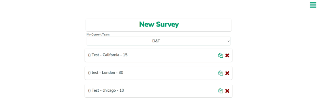
Before: a bare list, no context
The old landing page was a thin 'New Survey' list, a team dropdown and a few unstyled rows with delete icons. No status, no deal context, no sense of where a survey was in its life. Everything a broker needed to know lived in their head or in another tool.
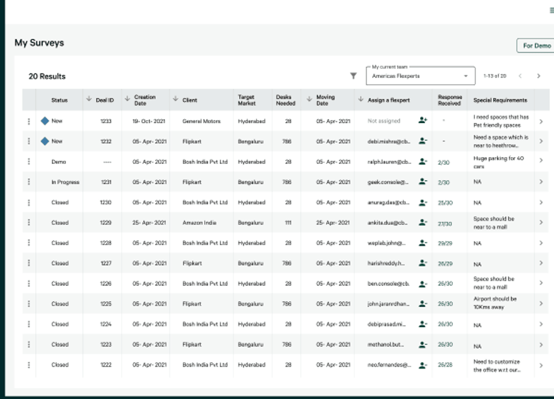
After: an all-in-one dashboard
The redesign turns that bare list into a real workspace: deal ID, status (new, demo, in progress, closed), client, target market, desks needed, moving date, the assigned flexpert, responses received, and special requirements, in one scannable table. Deal IDs are fetched automatically, so brokers stop hand-touching the database, and assignment moves into the tool itself.
05 Decisions worth defending
Move off no-code, to React
The no-code platform was the ceiling: slow, fragile, and impossible to grow on. Pitching the migration to React wasn't a designer's job on paper, but it was the only way the experience improvements would last. I made the case and the client approved it.
One dashboard, less platform-hopping
Brokers were stitching the job together across several tools and touching the database by hand. Pulling status, assignment and deal data into a single dashboard, with deal IDs fetched automatically, removed whole steps rather than just prettifying the old ones.
Make the search results actually scannable
The search-results page is where brokers spend their selection time. I surfaced the difference between provider sources, showed past client ratings, special requirements and a 'major provider' tag up front, and added one-click search and add-to-option, so choosing a space stopped being a hunt.
Responsive deliverable, merged into one
I merged the separate static and dynamic deliverables into one 'client deliverable' and made it responsive, so a broker can present and a client can review on a phone. The output finally matched how the work actually happens, on the move.
06 What I'd carry forward
This was an execution-heavy project: a real tool, real users, a real migration. Most of what I took from it is about how to run that kind of work, not just how to design it.
A different way of working
What I got wrong
01Document everything, in the cloud
Deliverables, iterations and conversations are easy to lose across a long project. Keeping artefacts in the cloud, accessible from any machine, meant the team could always see why a decision was made. Documentation is part of the design work, not an afterthought to it.
01Under-prioritising the user stories cost us time
Lack of prioritisation on the user stories delayed the development of the new survey-creation tool. I learned to push for a ranked, agreed backlog early, so design and build don't stall waiting on what matters most.
02Pitch the value of design in their language
Getting the platform migration approved meant arguing design and research value to people who don't think in heuristics. Framing the redesign as time saved and risk removed, not as craft, is what moved it forward.
02Watch your tone in research sessions
In interviews and usability tests you represent the whole team to the user. I became far more deliberate about behaviour and tone, and about not asking leading questions, because the quality of what you hear depends on it.
07 Outcome
Survey creation time fell by roughly 14 minutes per survey, time the flexperts could spend serving more clients instead of fighting the tool.
The redesign optimised the end-to-end journey and cut the dependency on other platforms. The migration off the no-code platform to React was approved, giving the product a foundation it could actually grow on, and the responsive client deliverable let brokers help clients find their next flexible space on the go.
Why this one matters to me
This is the unglamorous, important kind of work: a tool people use every single day, made measurably faster and calmer. No one writes case studies about internal broker tools, but cutting 14 minutes off a task someone does dozens of times a week is real leverage. It taught me to respect the daily driver, the screen someone never gets to escape, and to treat saving their time as a serious design goal.